Hundreds of customers.
One control room.
Managed service partners (MSPs) were logging into dozens of client accounts every morning just to find broken backups. I designed the operational dashboard that consolidates failures, storage spikes, and security risks into one clear view.
Problem vs preferred scenario
From logging into every customer — to one morning view
Problem · Existing
Partner IT admins had to open each customer account one by one just to see if backups were failing.
- No single place to look — failed backups, storage spikes, and license expiries lived inside each customer account
- Warnings were buried — critical alerts sat three or more clicks deep inside individual dashboards
- Impact: mornings burned ~2 hours logging into dozens of accounts before real triage could start — so failures and renewals were easy to miss
Preferred scenario
One control room for every customer
- One operational dashboard that shows every client account at a glance
- Only the exceptions — failed backups, storage spikes, security risks, and contracts about to expire
- Click straight into the fix without losing the big picture
Final Design

The Problem
Partner IT admins had to open each customer account one by one just to see if backups were failing.
What went wrong — and who got hurt:
- Account hopping: Admins opened each customer’s account separately to check backup health, storage, and licenses.
- Missed failures: Critical backup alerts sat three clicks deep — easy to miss across a long client list, so data risk stayed hidden.
- Missed renewals: Expiring contracts hid inside tenant settings, so partners missed renewals and upgrades.
“I shouldn’t need two hours of logging into accounts before I know who’s on fire.”
Alex starts the day looking for failed backups and SLA risks. Mid-day is storage and quota checks. Weekly, Alex helps account managers spot renewals and upgrades. Alex is not a security specialist — just needs enough risk signal to escalate real problems without drowning in noise.
- See every at-risk customer in one view
- Fix backup failures before customers notice
- Spot renewals without digging into settings
- Switching accounts just to check status
- Critical alerts buried three clicks deep
- Renewal signals hidden from the daily ops view
- Starts every day with a failure sweep
- Looks for red/amber before reading charts
- Opens a customer only after a problem is confirmed
- A fast “what’s broken” overview
- Clear split between triage and deep analysis
- Views that only show what their role is allowed to see
Every time Alex opens the dashboard
- Which customer backups need attention this morning?
- Is anyone using an abnormal amount of storage today?
- Which contracts or trials expire this week?
The hard constraint: different roles, same screen
Different job roles see different data on the same layout. If someone lacks permission, the screen still has to look complete — not broken or empty.
| Component | Full Admin | Limited Admin |
|---|---|---|
| Dashboard View | Sees data for every customer | Only sees their assigned customers |
| Failure Triage | Can view and fix issues for any customer | Can only fix their assigned customers |
| Security Widget | Can see and dismiss security risks | Cannot see this section at all |
| License View | Sees license data for all customers | Sees license data for their own customers only |
Step 1
Mapping 50+ system metrics before drawing UI

Plotting the flow and sections
I plotted the diagram based on the PRD provided by Product managers — mapping every flow and section before drawing a single UI screen.
Working through that structure made one grouping decision clear: Security and Products can be clubbed together, instead of living as separate competing areas on the dashboard.
Move over the map to magnify detail, or use Zoom for the full popup.

Step 2
Low-fidelity structural wireframes

Structures and their importance were generated and prioritised using Gemini—mapping navigation, filters, and every widget before any UI work began.
The low-fidelity wireframe was then created to get a basic preview and structure: empty blocks, no real data, just enough to test hierarchy and see where usage charts would bury licensing work.
Problem: Not every piece of information has to be a separate block — related information can be clubbed.
Process
How the screens were built
Manual coding on AmCharts
Hand-coded chart prototypes to land the right set of graphs and pie charts before committing the dashboard layout.

AI screen generation
Explored full-screen options in Figma Make to pressure-test hierarchy and density quickly.

Manual screen generation
Composed screens manually with AI assist and existing product widgets to stay close to the real system.

Step 3
Failed iterations & why they broke
Scrapped 01: The Overloaded View

Usage Monitoring
Global and individual customer overviews—quota signals plus the SaaS and Enterprise usage charts competing for the same canvas.
Licensing & Admin Overview
Everything else stacked below—expiring contracts, lifecycle states, security add-ons, admin accounts, API keys, audits, and support tickets.
- Concept: Kept all the information on one continuous scroll—but nothing was segregated or grouped by job.
- Why it failed: Usage charts pulled more attention than licensing, and packing too many graphs and KPIs onto one page felt overwhelming.
- Key Takeaway: Information needs clear grouping by workflow—usage and licensing can’t compete for the same canvas.
Scrapped 02: The Half-Measure

Licensing & Admin Overview
Customer summary, licence distribution, security posture, and the rest of the account/admin view stacked above.
Usage Monitoring
Usage charts and quota are related, so they belong together—with a customer filter to scope both. Even then, too many informations, alerts, and graphs stayed on one page.
- Concept: Summaries moved up; usage charts and quota sat below with per-customer search inside the card.
- Why it failed: Usage and quota belong together and need a customer filter—but the section still packed too many informations, alerts, and graphs.
- Key Takeaway: Consumption analysis needed its own room—not a footer.
Step 4
Why we split 1 dashboard into 3 tabs
Quota and Usage Monitoring carry denser graphs and support both global and customer-level views, while Accounts & Licensing is a global admin view. Those are different headspaces—so they belong on different tabs, not the same continuous scroll.

Tab 01
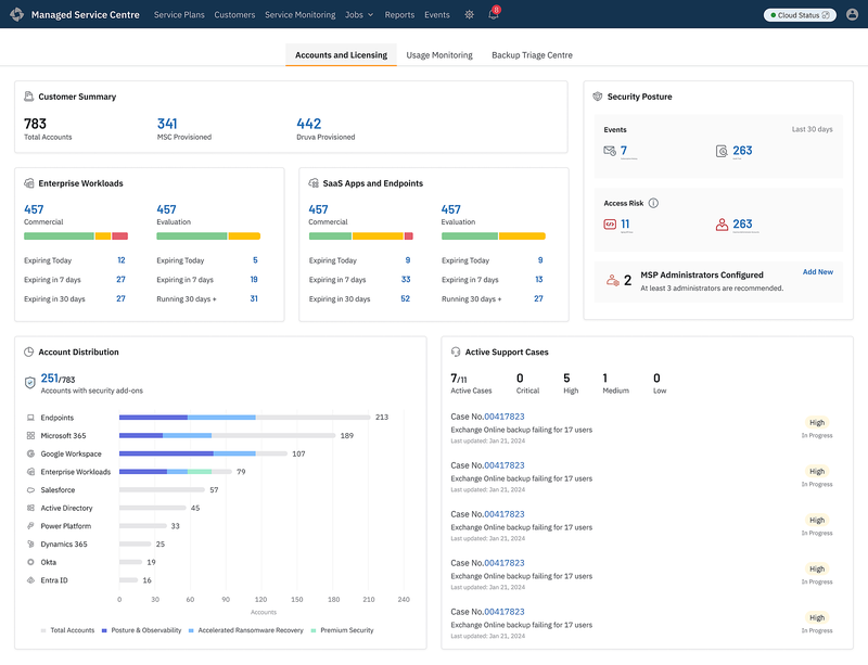
Accounts & Licensing
Customer Accounts, Tenant Visibility, Product Modules, Security Posture, and active Support Cases.
Tab 02
Usage Monitoring
Changes based on the customer selected—usage trends, quota alerts, and storage consumption.
Tab 03
Backup Triage
Scoped as a separate project—to surface overall backup failures and prioritise which customers need attention first. This tab is the entry point for that morning triage workflow.
Final shipped solution
Initial Screens
Early tab builds used to pressure-test density, RBAC, and how much each workflow could carry before shipping the dedicated views.

Tab 01
Accounts & Licensing
- Focused on licensing information for a global admin view
- The user should not scroll — everything should be visible on a single screen
- Even with RBAC, the screen should not look blank

Tab 02
Usage Monitoring
- Graphs make usage easy to visualise and less cluttered
- Graph UI is simple and changes for individual customers
- Enterprise Workloads — Native and Hybrid — can need 4 graphs. Tabs alone are not very scalable
- The user should not scroll — everything should be visible on a single screen
- Three graphs stacked look like three sections — but it is really just two

Tab 03
Backup Triage Centre
- Entry point to see overall failures and prioritise customers
- Scoped as a separate project—deep remediation stays out of this view
The shipped solution — 3 dedicated workflows
Split one overloaded screen into three tabbed surfaces — each answering a morning ops question.
Question answered: Which customers need commercial attention today?
Scope: Global admin view showing customer accounts, tenant visibility, product modules, security posture, and active support tickets.

Question answered: Which tenants are consuming resources abnormally?
Scope: Dynamic usage trends, quota alerts, and storage consumption per selected customer.

Deliberate UX trade-off: Per-product storage numbers live inside hover tooltips rather than separate cards — keeping the chart scannable for quick spike detection.
Question answered: Which customer backups require attention this morning?
Scope: Exception-based failure table prioritizing accounts that need instant remediation.
Separate project
Failure triage, customer-first
Backup Triage was scoped as a separate project — overall failure view and customer prioritization first. Deep remediation stays out of scope; this tab is the entry point into that workflow.

Data visualization
Iterating the Triage Table
The triage table took a few tries to get right:
Heat map
A heat map shows the failure trend across days so admins spot rising risk at a glance.
Bookmark the customer
Admins can bookmark the customer they are watching so priority accounts stay pinned during morning triage.
Workload-level failure
Workload-level failure stays split by product type—so Enterprise and SaaS don’t collapse into one misleading number.
Iteration 1 — Single filtered table

- One table filtered by a workload dropdown
- Technicians had to switch the filter before every triage pass
- Too much information, less prioritised, and more space wasted
Iteration 2 — Combined Customer × Day matrix

- Per-day heat map made failure scanning faster
- Merged two products with different sync times into one cell
- Tiny sub-labels to see which product actually spiked
Iteration 3 — Split into independent workload tabs (shipped)
Enterprise Workloads and SaaS Apps & Endpoints each get a persistent tab with its own table and sync timestamp — accurate data, faster switching than the original dropdown.
Reflection
Learning
Early customer feedback
The product was shown to customers at the initial design stage to get feedback—and the feedback was positive.
End-to-end ownership
Handled the complete project and presented it to senior-level directors and engineers.
Show only vital signals
Simplified graphs and information instead of packing multiple metrics—and convinced product managers to show the right, vital information.
Confidentiality note: This project is under NDA. Design is complete and moving into development.
Interface redrawn and figures synthesized for case study presentation.
The core architectural logic and UX constraints remain true to production.